
EX REMEDY
Case study
ExRemedy a cure for hearthbreak app design

-Breakup app design-
Tools: Miro, Maze, Usability Hub, inVision, Figma, Adobe CS
My role: Responsive design, Moodboard, Styleguide, High definition mockups, Visual design, Creative direction
Team: 5 designers
Overview of case study
Problem:
Most people have gone or will go through a breakup at least once in their life. The majority of people rely on support from friends, family, and time to get through a breakup. However, not everyone has the luxury of having friends and family around them during the tough time!
How might we decrease the duration of the healing process and provide a support system which people can rely on for getting through hard time and come out as a more self-aware person?
Solution*
In order to support our users, we wanted to create an app that has daily check-ins for mood and goal setting, and a library relationship resource. We believe that having a better relationship education can help increase people's happiness with themselves and their relationships!
RESEARCH
What we wanted to know:
*Breakups
How people experienced their breakups whom they turned to when recovering.
*Self-care
How common self-care is and what kind of practices our potential users participate in.
*Awareness
How important the concept of self-awareness is to our users.
*Relationship
How people experienced their breakups whom they turned to when recovering.
Interview summary:
When interviewing people about their breakups and emotional recovery we found similarities and affiliations. We did 7 one on one interviews with 5 females and 2 males and here are our findings:

-
Felt like they wanted more education around relationships and were open to online resources (App)

-
College Educated
-
Experienced bad breakup
-
Reached out to a friend or family member
-
Said it was harder than they anticipated
Survey summary
After conducting interviews and analyzing data we found similarities in answers which we wanted to explore more. We created a survey that focuses on uncovering people's motivation for being in a relationship, what is most important to them and the reasons for the breakup as well as whom they trust when feeling vulnerable.
Here are our findings and top 4 answers:

Meet Samira our user persona
Based on our interviews and survey results we synthesized our data findings created an affinity and diagram empathy map in order to visualize and better understand our potential user.

Samira's Story
Samira broke up with her boyfriend and doesn't know what to do. She wants to understand what went wrong and has been calling her friends, but her friends don't know how to help her and are busy with their own lives. Samira turns to the good old internet and starts finding articles about breakups but is overwhelmed by the amount of content.
She finds a lot of information conflicting and she ends up more confused. She tells her friends about her confusion and they recommend Ex Remedy, saying that another friend had found it helpful in getting over their nasty breakup.
Samira is skeptical but willing to try anything that might help. She downloads Ex Remedy. Samira is prompt to create a profile in order to customize the content. She likes that it's personalized to her current interests and mood, so she feels that she'll be receiving content that will help her recover faster and learn more about healthy relationships and herself. While using ExRemedy Samira is given daily goals based on her profile and She is starting to feel hopeful.
After some time, Samira feels that the app is working. She learned that her relationship wasn't healthy with the lack of clear communication and commitment levels. She's feeling calmer and more focused on the future, but she wants to progress even further. She visits her profile to add additional daily reminders with content. She wants to be more active in her recovery now that she sees that there's been a positive effect.
Samira's Journey

Prioritization matrix
After finalizing user research and getting the full understanding of potential users, their needs, wants, and goals we continued by conducting I wish, I want, what if exercise, and creating a prioritization matrix. Having in mind our user persona and her needs we prioritize features we want to develop making sure they correspond with the user's needs and the company's value proposition.
High-Value low urgency
01. Daily habit buildings
02. More specific progress tracker
03. Create a playlist based on mood
04. Access to an online therapist
05. Scenario role play (video/quiz)
High-Value high urgency
01. It has a forum where people can share their stories
02. Educational videos for self-care and healthy relationships
03. Journaling options
04. Educational articles
05. Has section for personal growth
06. Daily quotes
Learn about our
competitors

PROTOTYPING
Site Map
-
Divided the journey in 2 pathways of educational or distractions + mood check
-
Organized the library content in 3 different forms of articles, videos, and audios

Low Fidelity Prototype
After creating a prioritization matrix, tackling information architecture, and creating a site map we developed a low fidelity prototype in order to start visualizing the product and to be able to test it with potential users.

Usability testing
We wanted to test how easy would be for our users to accomplish 3 simple tasks. We wanted to know:
1. Status check and find distractions
We tested whether users were easily able to go through the daily check-in process and choose to distract themselves.

Results
-
Out of 10 users, 8 users were able to complete the task successfully leading to an 80% completion rate.
-
2 originally clicked the learning path.
-
2 testers tried to skip the check-in process
-
2 testers clicked multiple times on the heart image, mistakenly thinking that it was clickable
2. Publishing a Journal Entry
We want to know how easy is the user able to create a journal entry, publish it, and view it?

-
90% of users were able to successfully complete the task
-
4 users miss clicked when looking to create a new journal entry.
-
1 user spent 15 seconds before clicking on the correct icon.
Results
3. Finding an Article
We set out to see if the user able to find an article and take the quiz?

Results
-
8 out of 10 users were able to complete the task.
-
7 users clicked on the first article shown on the home screen without looking around
-
2 users accessed the articles by clicking on the library icon.
Post-Testing Prioritization
What We Learned
-
Most people would like to take a quiz after reading an article
-
Testing questions need to be clearer
-
Journal entry: multiple steps confusing
Iteration To-Do
-
Make tab bar sticky
-
Change heart on the status screen
-
Add text to journal entry icon
VISUAL DESIGN
For our mood board, we wanted to create an upbeat and sassy mood that captures the bitterness of the breakup through a positive outlook.
Yes, we know breakups suck are hard and hurt like hell. We’ve all been there, but they hurt less with a little bit of laughter. To quote Friedrich Nietzsche “That which does not kill us makes us stronger.”
So, a woman of the world put on your war paint and laugh your broken hearts off.

Style Guide
Because we wanted to bring a positive mood into a hard situation, we decided to go with bright upbeat colors, illustrations, and images which, if nothing else, would make you smirk a little and feel a bit better. Even the hardest situations are easier to overcome with a dash of laughter. When you don’t know if you should cry or laugh, choose laughter always as laughter is strong medicine.

Preference testing
Keeping our user persona and mood board in mind we created initial mock-ups of how it might look, but before moving forward with the implementation we wanted to test the market and user preferences. We created two completely different moods of the same product and tested the market and preference.
OPTION A

OPTION B

We created a second mockup with quite a different mood, color palette, and images that capture the sadness of a breakup. This style has more mature images and a serious color palette. We did a round of preference testing and found that out of 10 people tested, 7 preferred a more serious mood and toned-down palette.
Updated Style guide and Moodboard
The majority of our test users preferred the option B mockup. We iterated and updated our mood board and style guide with darker, more soothing, calming colors, and images. Insights we discovered during preference testing helped us gain knowledge and opened new possibilities and directions on how to develop our app.


HI- FI MOCKUPS

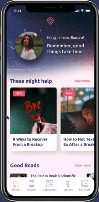
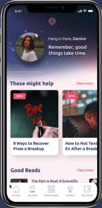
Status Check
-
Asking users about where they’re at on their path on a daily basis
-
Depending on the status selected, we customize the content to match their current needs
-
If someone is going through a tough time, to help them level up, we prioritize the content in the following order
-
acknowledge hard feelings
-
sympathize
-
propose ideas on the next steps
-
encourage
-
Library
-
Besides our recommended content based on our user’s needs, we also offer a full library of articles, videos, and audio files
-
Everything is organized in these 4 main categories depending on their love journey :
-
Broken Heart
-
Self Care
-
Dating Tips
-
Relationships

Wallpapers
-
We offer many distractions to help our user’s mood
-
Wallpapers are entertaining and they can distract the users
-
They can choose a variety of categories depending on their mood and set their choice as their wallpaper
Journal
-
One of the most clicked distractions
-
Users have the ability to keep the post private or publish them in the Community section
-
When publishing a journal entry in the Community section, users have the option to do it anonymously
HI-FI USABILITY TEST 1
User Pain Points
-
7 users clicked on journal entry text instead of the icon.
-
4 users got library and journal sections confused due to competing icons
-
3 users clicked on the save button before writing an entry
Iterations
-
Make journal icon and text clickable
-
Changes tab bar icons
-
Make save button inactive/unclickable until content is added
HI-FI USABILITY TEST 2
User Pain Points
-
100% of users were able to complete the journal entry task
-
80% of users completed community task with minimal difficulty
Iterations
-
Further develop community section
User Insights
"I think it's a really interesting concept. I think it could be helpful to many people."
"It seems useful for people going through a breakup"
Next Steps and Takeaways
Next Steps
-
Coming up with a way to record progress tracking
-
Further, analyze testing results
-
Fully build out the content for different paths of the journey
-
Build out quizzes for articles
-
Revisit and further test our visual design
-
Accessibility Testing
Takeways
-
Make sure that the prototype is fully functional before testing
-
Taking advantage of resources available, such as Maze testing
-
Don’t trust surface-level data, fully analyze results
-
Importance of icons matching the label and not competing with each other
