City of Palo
Alto website
redesign
Case study
The City of Palo Alto website is a place where residents and visitors go to inform themselves on the latest happenings and developments, find information about the city, and what the city has to offer as well as how to get involved with the community.

-Redesign for government website-
Tools: Miro, Google suit, Illustrator & Photoshop, Figma, INvision
My role: User research, Heuristic evaluation, Information Architecture, Navigation, Responsive design, Moodboard, Styleguide, High definition mockups, Visual design
Team: 5 designers
Overview of case study
Problem:
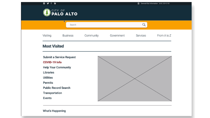
The City of Palo Alto website is outdated, has complicated navigation, broken links, misplaced information that is hard to find as well as it is not conducive for community involvement.
During our user testing, we discovered that users had a hard time uncovering information, accomplishing tasks they wanted and were not able to easily connect with the community and find information about community gathering and involvement in the city. Therefore, we believe by simplifying navigation, reducing and reorganizing categories we might help residents and visitors of the City of Palo Alto engage more with the community.
Solution*
Develop an accessible community section that draws the user to engage with the community via a modern, easy to navigate webpage.
...PROCESS...
In comparison to previous projects, our team was working on a redesign of something already in existence. Our approach and steps we have taken to get there were a little bit different in a way simplified but with more depth and paying greater attention to details. Navigation and easy access to information was our primary goal.
High Definition mockups
5-second Usability testing
User testing and prioritization
Prototype iterations
01. Research
Our team conducted user testing. We quickly realized the City of Palo Alto website has accessibility issues, users were not able to find the information they were looking for, and getting connected with the community was unsuccessful. We decided to create an additional category and introduce it to the existing site. The category we decided to go for was the community as residents of Palo Alto feel passionate about their city and being connected to the community, city, and visitors is really important to them.
Meet Simon our user persona
Based on our user testing and pain points of our users we synthesize our data findings and created an affinity diagram and empathy map in order to better understand and build our user persona.

The main problem with navigation
Simon's journey with the current Palo Alto website
01. Simon is recently retired and going to be a grandad soon, he wants to volunteer for a non-profit org and get involved in youth camps, etc. As he wants to search for non-profits, he logs on to the main Palo Alto City site and clicks on the “Community Partners” link to find out how he can get involved with community youth programs.

03. Since Simon can’t find what he’s looking for under the “non-profit” link, he decides to do a search on the City site. He types in “non-profit organizations, nonprofit, non-profit, etc... He tries every possible combination to find something about youth programs but with no results.

05. He does a Google search for “non-profit organizations in Palo Alto California”. Voila - he finds a really cool website that has tons of information including programs for Youth in Palo Alto. He found exactly what he was looking for and wondered why he couldn’t find it on the City of Palo Alto website...

04. Simon, again, does not uncover what he is looking for...the searches don’t have anything to do with nonprofits. Simon feels confused and frustrated.

Heuristic evaluation of existing site appearance
While conductin heuristic evaluation to determine whether and in which amount website is user friendly we found:
CONTENT
* Too much information
* Hard to scan
* Search results inaccurate
APPEARANCE
* Cluttered and overwhelming
no obvious visual hierarchy
* Font size small and hard to read
02. Simon is excited to see a “non-profit” link. However, he doesn’t see anything listed for Community Youth Programs. He searches every link possible on the site to no avail.

NAVIGATION
* Not consistent
* Organization of information does not follow a mental model of the user
EFFICIENCY
* Out of 3000 web pages, found 128 broken links
* The user does not know the status of the search description
*SEE FULL REPORT*
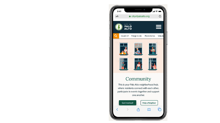
Community Section

Based on Simon’s journey, our user persona, we decided to build out the community section of the website. We wanted it to become a neighborhood hub where residents can connect with each other, participate in events together, and support one another. We wanted to provide resources so that Palo Alto’s strong community can continue to thrive.
Usability testing
While conducting usability testing our objective was to discover how usable the community sections on the City of Palo Alto website are and how the site design affects a user’s experience. We asked our users to perform 4 tasks:
01. Is the user able to locate information about nonprofits?
02. Is the user able to find and sign up for community events with neighbors?
03. Is the user able to locate information about library hours and location?
04. How easy is it for the user to locate testing information about Covid-19?
59.38% Task Completion Rate
User's Main Pain Points
-
Search results irrelevant
-
Too many categories and navigation bars
-
Visual cues don't align with the user mental model
-
The organization of the website is misleading
-
Accessibility concerns with font sizes
User Insights:

Tayra Jonson
PR Manager
“Was not clear if the classes and the events were paid or not. Hard to find specific categories and information”

Berat Starom
High school teacher
“Public Announcements should be prominent on homepage”

Mila Simons
Retired professor
“Hard to find specific categories signing up for community events did not seem easy”
Conclusion
During our heuristic usability evaluation, we noticed there is not one clear category where user can go and inform them selfs about community and events and that pieces of information are scattered all over the websites and there is not one clear and easy path to get to them. Because of this, we decided to reorganize navigation and address information architecture before moving forward.
02. Ideation
Information architecture
The existing site navigation overwhelmed users with too many options. Many items are not categorized in places that were users expected. We needed to help users easily navigate the website by improving the information architecture and fixing the search results page. We hope to accomplish this by reducing the number of navigation bars and streamlining the information on the website.

Wireframe Sketches
After tackling information architecture, reordering items, and creating a new category with a focus on the community. We were ready to start sketching and visualizing the future website.


Navigation prototype Interaction States
We decided to simplify navigation, by creating a community category, with 4 simple subcategories, places to visit, things to do, get involved, and Covid-19. By reducing the number of main categories and subcategories we were able to more easily direct users to find the information they were looking for.
Prototyping
Improvements
-
Reorganized top navigation following the LATCH principle
-
Followed accessibility guidelines with a focus on font sizes and contrast
-
Implemented z-pattern for easy scanning
-
Applied responsive web design (RWD)

After tackling information architecture, creating low fidelity, and doing 5-second usability testing we were ready to move forward toward developing and implementing the visual part of the design.
Visual Design
Moodboard
At the first glance, the city of Palo Alto looks very traditional and conservative but in the fact, some of the most progressive thinking, innovation, and inventions are happening behind the doors of this dreamy town.
We were guided by Palo Alto’s impression, atmosphere, and history of the city including the people who live there. Palo Alto shows a duality of tradition and innovation that we wanted to convey with a retro-modern style.

Style Guide Iteration
Our team went through various iterations with the font style and color scheme. We initially decided on using the font families, Abril Fatface and Lato to keep a retro-modern appearance. We quickly realized there was only one font-weight available for Abril, and font stroke would disappear on smaller screens
creating accessibility issues. While we strongly preferred Abril, we decided to change the header font to Lora. Even though Lora is not as visually striking, we decided to use it since it is more legible and easier to read in small sizes.


For the colors, we decided to use colors represented on Palo Also and Stanford university flags as they carry curtain symbolic and messages. The red and green that we initially chose have the same value, causing accessibility issues for users with impaired color vision. Again, we focused on the user experience and adjusted our colors. We decided to stay in the same color scheme but to use shades of red and green with bigger value contras and are easier to distinguish by people with impaired color vision.
COLORS

Chromatic

Achromatic

New Palette
Style guide
Taking into consideration all of our findings, we updated the style guide and decided to go with a different font and lighter hues.

03. Hi-def Mockups and testing
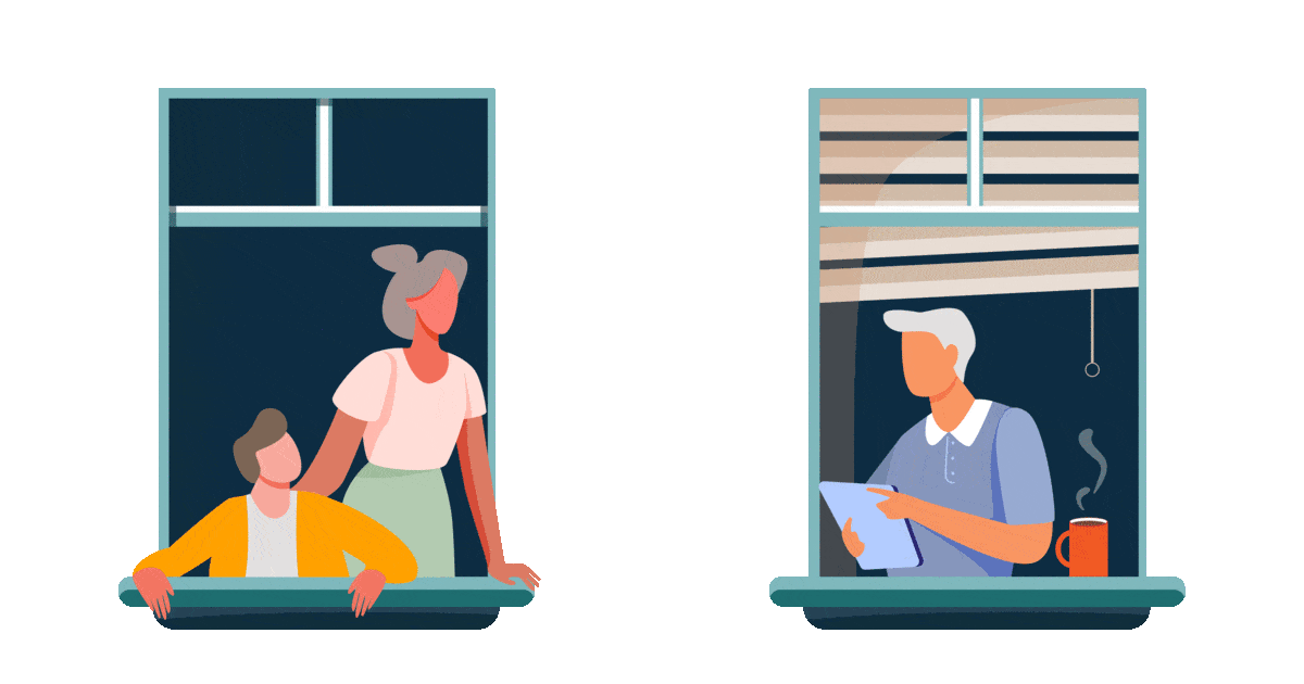
When applying visual design, we wanted our hero image to illustrate the diversity and connection within the Palo Alto community during these uncertain times. We focused on integrating warm and cold hues to striking a visual balance. In order to follow accessibility guidelines, we tested colors and fonts multiple times to create the best combination.


Mobile navigation
Designing navigation for mobile users was a big challenge. It should not only show where you can go but also where you are now. Each page on a website could be the first page your website visitors see, so it’s important to convey enough context so that people can proceed immediately toward their goals. Here's what we focused on:
-
The compact search bar that's easily accessible
-
Multiple options to navigate through the site since most users we tested preferred not to use the hamburger menu.
-
Strong location indicators
Usability testing
First Impressions:
-
Immediately knew it was the City of Palo Alto website
-
Initially thought it was a COVID-19 page, then figured out it was a community page
-
Able to understand the purpose of the site
-
Liked the layout, clean, neat, and organized
-
Navigation made sense
Next Steps:
-
Make the “Community” title more prominent
-
On the Community page, make sure the next section title doesn't compete with the page title
-
”Get Involved” CTA didn’t suggest action to volunteer
-
On COVID-19, important info was on the bottom making it harder to find
-
tie up loose ends on the prototype

Prototype iteration
Since it wasn’t clear to our users that “Get Involved” meant to volunteer, we replaced it with “Volunteer” to be more direct. Since this is a prominent section on the website, we had to replace the copy in several places:
-
Community page hero
-
Community page secondary navigation
-
Top navigation dropdown
-
Sidebar navigation
-
Mobile hamburger menu
-
Mobile top navigation (including dropdown)

While conducting usability testing we noticed that information prioritization on the page was not corresponding to the mental model of the users. We decided to on the COVID-19 page, reprioritized the content by moving more practical information, such as testing, closer to the top. We were able to
4
SECONDS SAVED!


Before and After


Next Steps and Takeaways
Next Steps:
-
Mobile scrolling
-
Carousel structure
-
Apply redesign to the entire website
-
Do A/B Testing on loading options for cards (Load More vs. View All)
-
Logo Redesign
-
Nextdoor App integration for Social Networking
Key Takeaways:
-
Initially taken on more than was possible - had to be more realistic
-
Pivoted and focused on the most important element of the site - Community Section
-
Accessibility; Importance
-
LATCH principle made redesign navigation usable